The Art of Animated Infographics:
Making Data Come to Life
Aug 27, 2024

Animated infographics, the perfect blend of motion and visuals, take static data and transform it into a dynamic and engaging storytelling demonstration. These compelling visual representations not only efficiently simplify complex information but also significantly enhance audiences' attention, comprehension, and engagement by taking them on an enlightening journey through your datasets. Focusing on animated infographics, this blog will serve as your guiding companion—by unravelling the art of visualizing dynamic information, you will be provided with the knowledge and skills needed to create compelling animated infographics that truly make your data come to life.
1.Differences Between Static Infographics and Animated Infographics
We have already learnt about the magic that cpativating visuals (including videos and images produced by photography and 3D rendering) can effectively exert on attracting audiences' positive responses. Reasonably, combining these high-quality visuals with intricate data for information simplification is widely used across various fields, and this is where traditional static infographics come from. To be more specific, static infographics can be perceived as an artistic version of a data snapshot, akin to a beautifully crafted painting. They present information in a fixed, easily digestible format, offering a concise, comprehensive overview without user interaction. Animated infographics, however, represent full-motion states that engage viewers with moving elements. They make data not just a source of information but a compelling, evolving story waiting to be told. Rather than demonstrating information in a frozen frame, animated infographics consider the interactivity that invites the audiences to be part of the story-telling process.
2.Different types of animated infographics
In general, animated infographics come in three different formats: animated GIF infographics, animated video infographics, and interactive infographics. We will introduce them one by one.
2.1. Animated GIF Infographics


Although animated GIF infographics (GIFs) are often simpler, they are nevertheless rather powerful. Notice the two examples above: in the first GIF, the desk converter rises upwards as the texts and symbols show accordingly, indicating that this desk converter is designed to possess six height levels that can be freely adjusted; in the second GIF, the full-motion characteristic of the monitor arm is vividly displayed via height adjustment, extension range, screen rotation, and swiveling functionality. As crucial information is delivered through the simple animation, GIFs are widely used since they effortlessly visualize abstract data and effectively make it "digestible".
2.2. Animated Video Infographics
Given the lack of sound capabilities in the GIF format which is one of its drawbacks, infographics with animated videos can be useful in this situation. When users are able to see and hear the content being displayed, comprehension and recall are greatly improved. For this reason, animated video infographics are considered necessary if you want your audiences to be not only visually attracted, but also audibly engaged.
2.3. Interactive Infographics

Both animated GIF infographics and animated video infographics are useful to make audiences feel mentally engaged, but how about physically interactive? That is exactly what interactive infographics consider, for they require some form of physical engagement to instigate action, whether that’s scrolling, clicking, or hovering. One popular example is the Amazon 360° spin product image. Using these infographics, a sense of interaction is said to be the strongest while observing viewers' responses.
3.Steps & Strategies of Creating Animated Infographics
3.1. Fully Understanding Your Audiences
The first and foremost step in the process of creating compelling animated infographics is gaining a comprehensive understanding of your audience. Knowing who your target audiences are, what their interests are about, and how they tend to consume information lays the foundation for visually presenting the data. Before generating your animated infographics, think carefully about these questions: Are my audiences more captivated by vibrant visuals or stirred by startling statistics? Do they prefer short, snappy infographics or more detailed, elaborate ones? Thoroughly satisfying your audiences' appetites can largely benefit your design choices and narrative styles. Another important thing is that the primary objective of creating attractive infographics is not just to impress your audience with fancy animations but to clearly communicate complex data in an easily acceptable, engaging, and memorable way. Delving deep into your audience's preferences to digest information will put you on track to crafting an animated infographic that not only plays the roles of informing or presenting but also resonating and engaging.
3.2. Choosing the Right Data for Your Infographics
Data choice can make or break your animated infographics—it's like picking the right ingredients for a meal. You're not just looking for any data, but the right ones that will intrigue, educate, and engage your audience. Given that one of the main characteristics of a successful infographic is relevance, it is crucial to ensure the data is pertinent to deliver the information that you want to demonstrate. Furthermore, the effectiveness of the infographic requires the data to be accurate, recent, and trustworthy. Different from trying exaggerated art representations to catch your audiences' visual attention, using exaggerated data is inappropriate, for it misleads the audience to rely on inconclusive information. Therefore, always remember to cherry-pick powerful and accurate data points that offer relevancy, clarity, and deep insight, so that the information expressed is ensured to be highly persuasive.
3.3. Incorporating Storytelling in Your Infographics
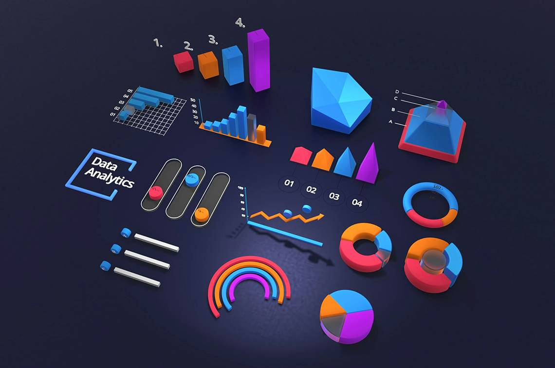
It is said by Ken Robinson that "visualization is the most powerful tool that we have for understanding data." After selecting the right data, it's time to think about how to weave a compelling story to narrate the information. Rather than merely combine the numbers with images, successful storytelling engages the audience by using attractive visuals to take them on an information-learning journey. To perform this, you need to consider the strategic use of colors, typography, symbols, and characters. While combining these elements, remember to be creative and innovative. An eye-catching visual should stir curiosity and surprise and invite your audiences to read the textual information spontaneously and willingly. For instance, an exploding pie chart, cubic bar chart, or 3D pyramid diagram can all contribute to arousing audiences' attention.
3.4. Balancing Visuals and Data
The final step in producing successful animated infographics is to achieve harmony between data and visuals. To be more specific, the balance between the clarity of the data and the impact of your visuals together makes an animated infographic textually informative and visually compelling. If you tip the scales too much towards images, your infographic can become visually overindulgent and data-starved. Meanwhile, if you lean too much towards the data, the infographic simply turns into a drab and uninspiring spreadsheet. For this reason, your visuals should not overshadow the information they're representing but rather amplify it—just treat your visuals as the supportive storyteller that helps to convey your data in the most meaningful and engaging manner. Similarly, your data should always consider conciseness and effectiveness to resonate with the visuals. Using the shortest length demonstrates the most crucial information.
4.Conclusion
As we've journeyed through the captivating world of animated infographics, one thing has become crystal clear—they're an artistic powerhouse transforming data into memorable visual stories. Whether chasing the simplicity of GIFs, diving into the dynamic world of video infographics, or exploring the interactive blend of data and design, each type has its own unique flavor to entice audience engagement. Remember, crafting these live canvases isn’t just about stringing visuals and data together. It’s about fully understanding your audience, digging out the right data that fuels your story, weaving that story using attractive visuals, and delicately balancing visuals with data. These steps are your compass in the journey of breathing life into raw data and making it dance to your tune. So dive in, explore, and experiment—it's time to let your animated infographics take your audience on an engaging visual journey they won't forget.